“TRAIL” ( 2016 - Present )
Reinventing the QR-code.
We've been collaborating with Trail since their inception a decade ago, and when they needed a rebranding, we were given the freedom to tackle the challenge. After extensive groundwork, we presented our concept to Trail with the message, "Before you say anything, sleep on it." The next morning we got a response: "You guys are crazy, let's do it!"
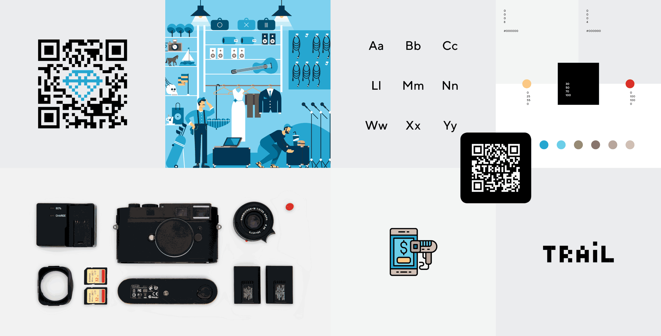
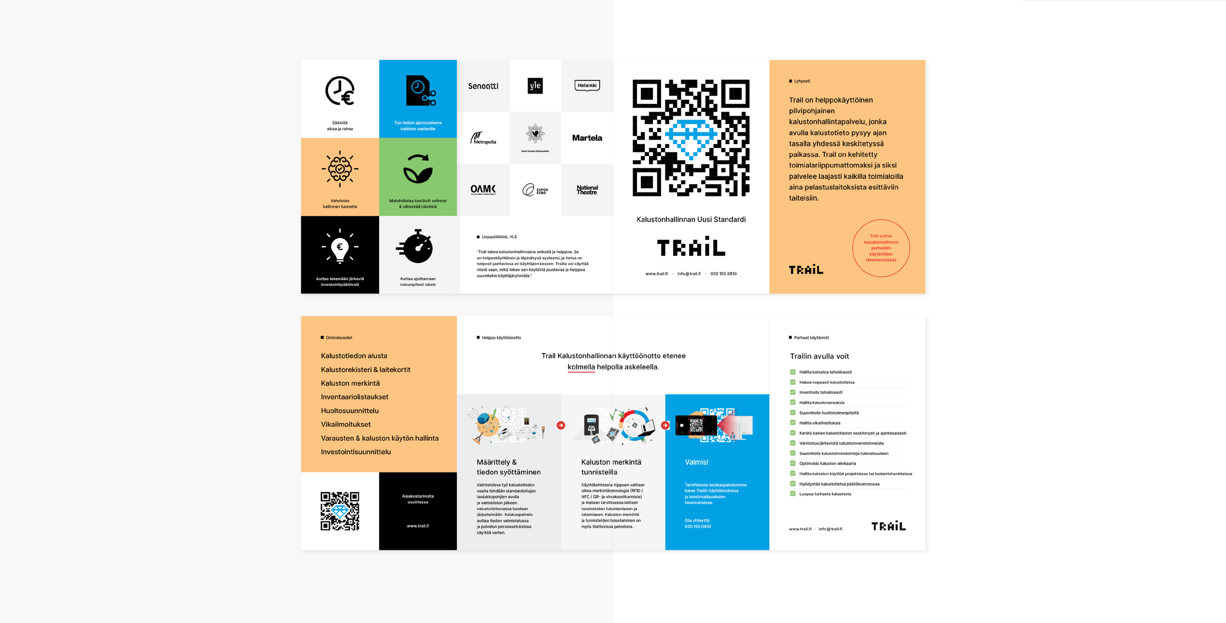
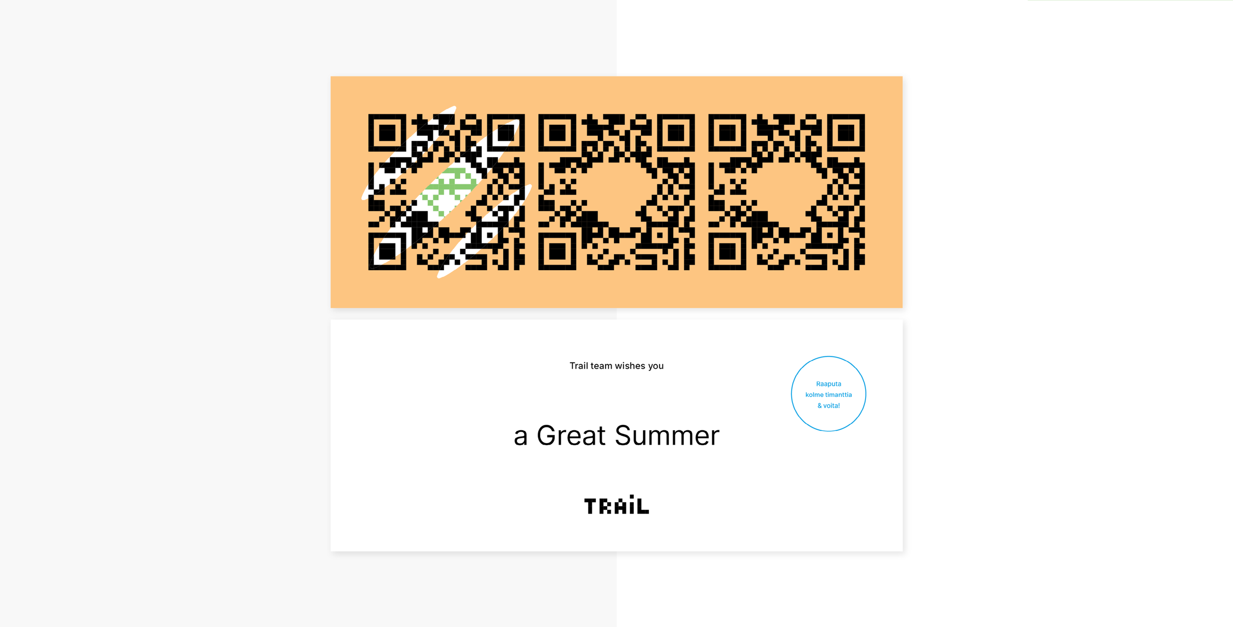
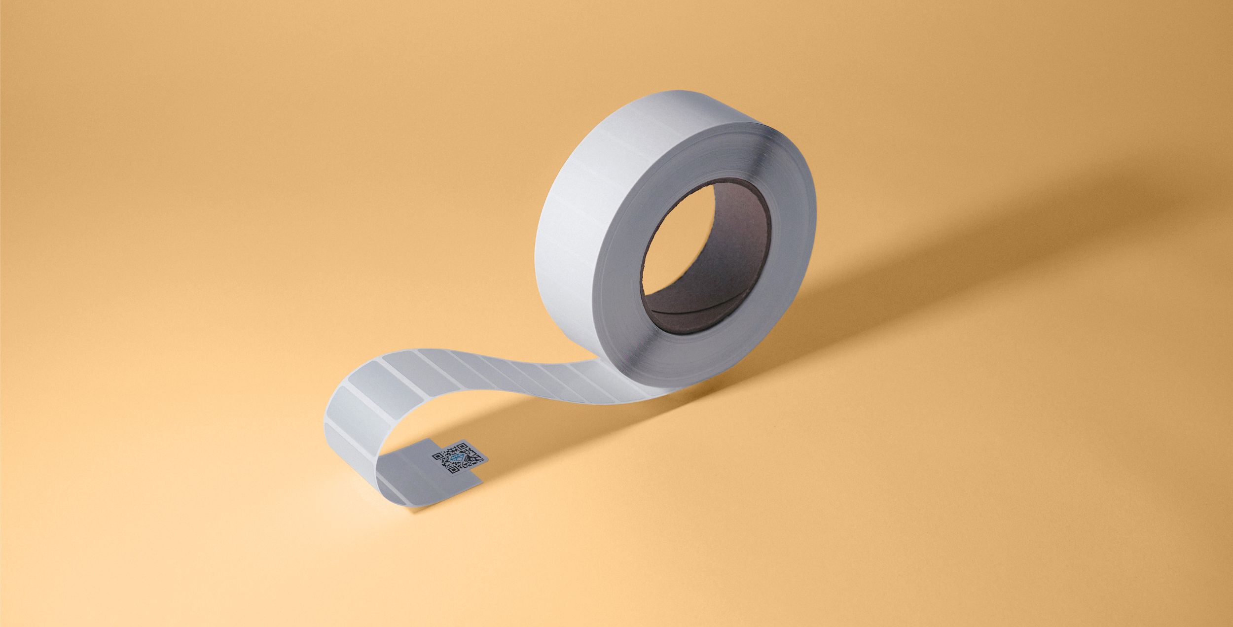
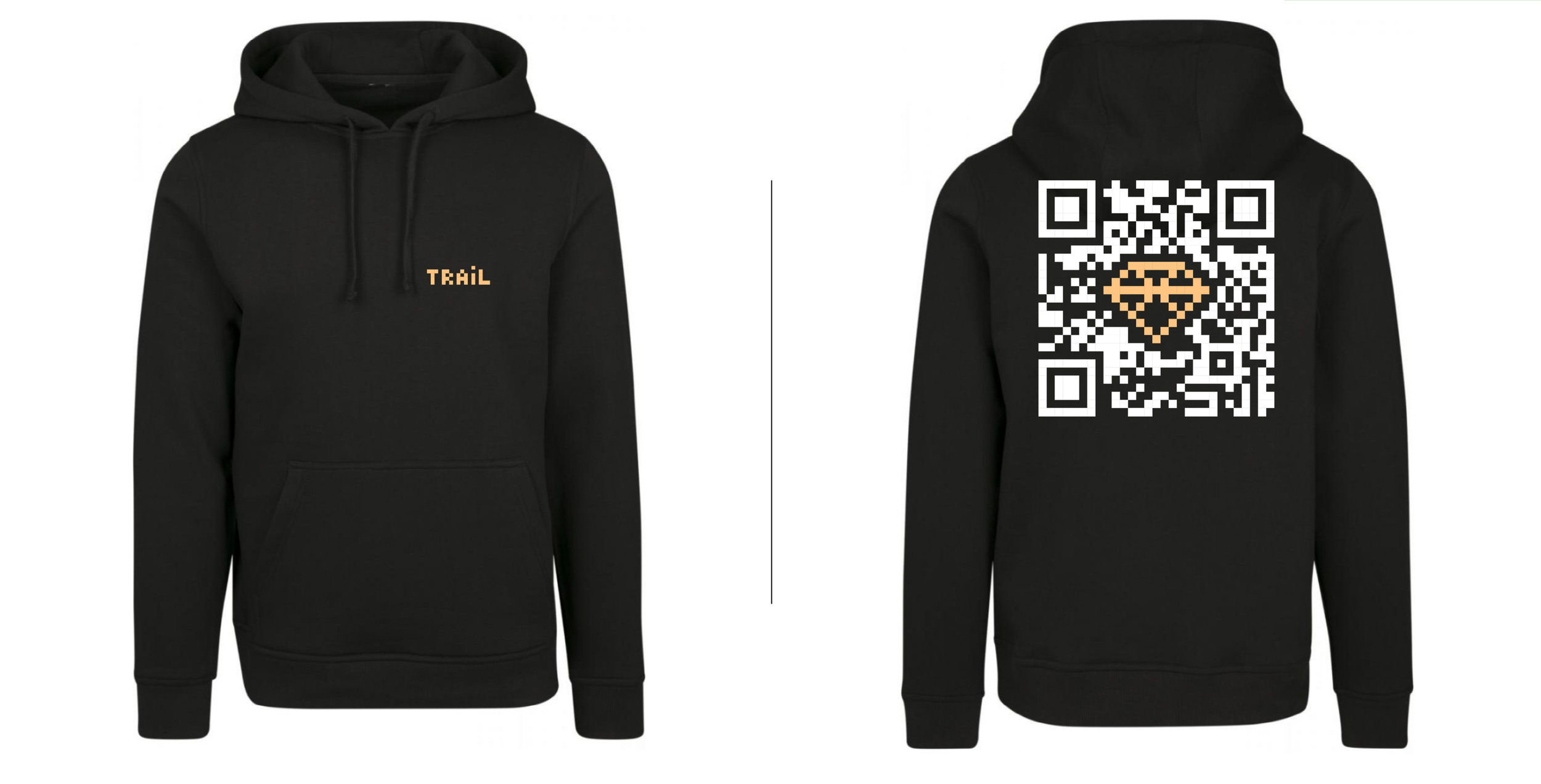
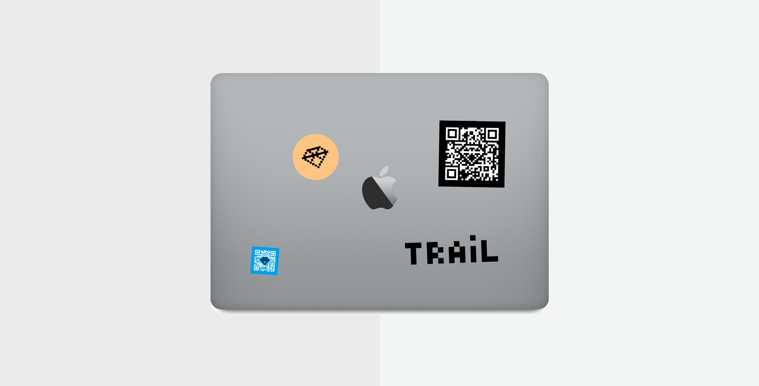
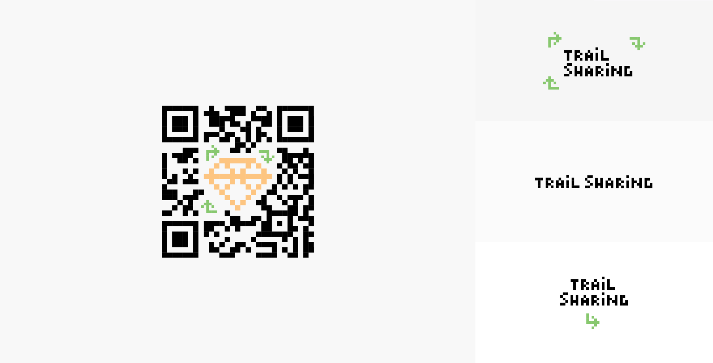
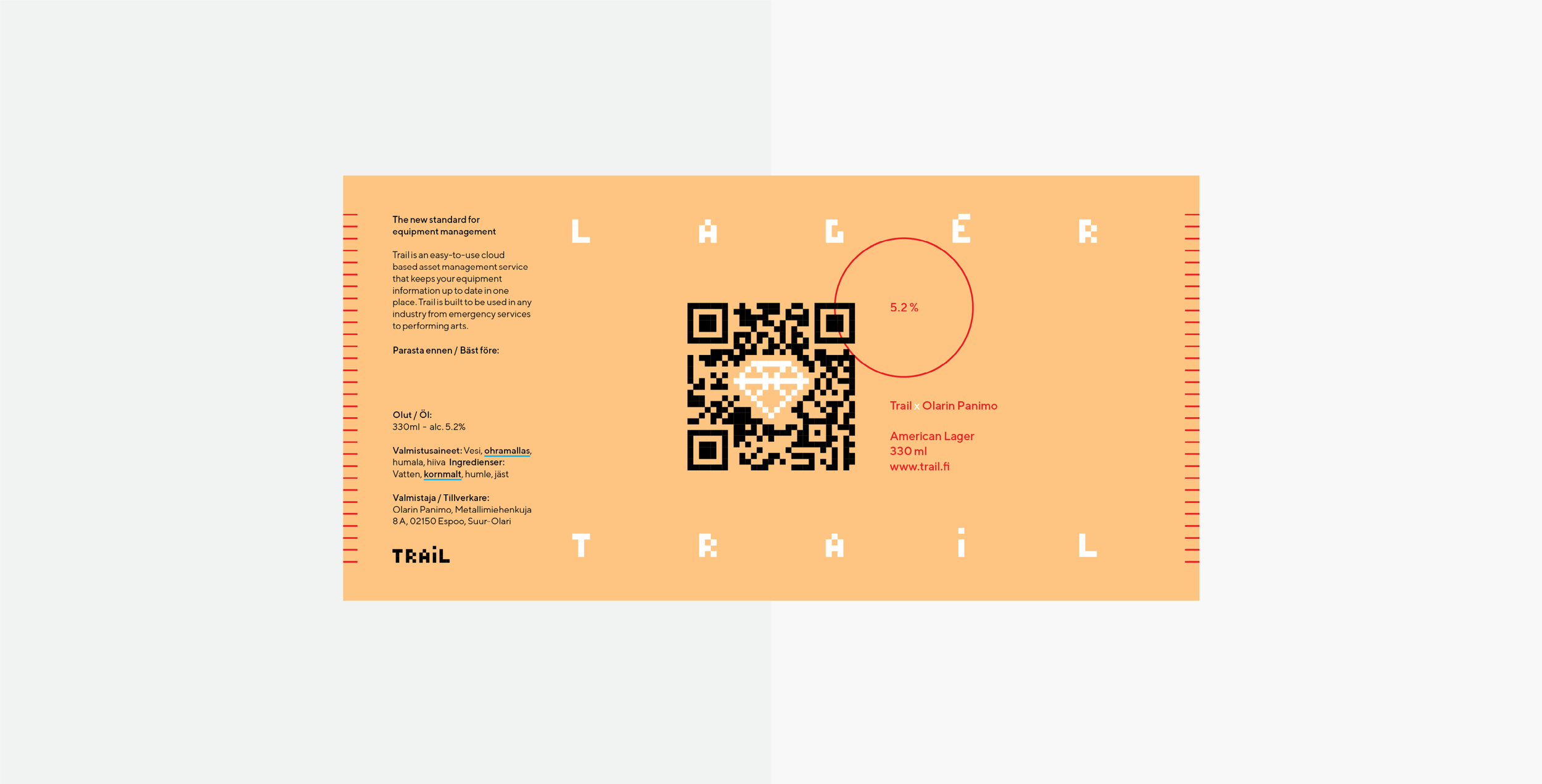
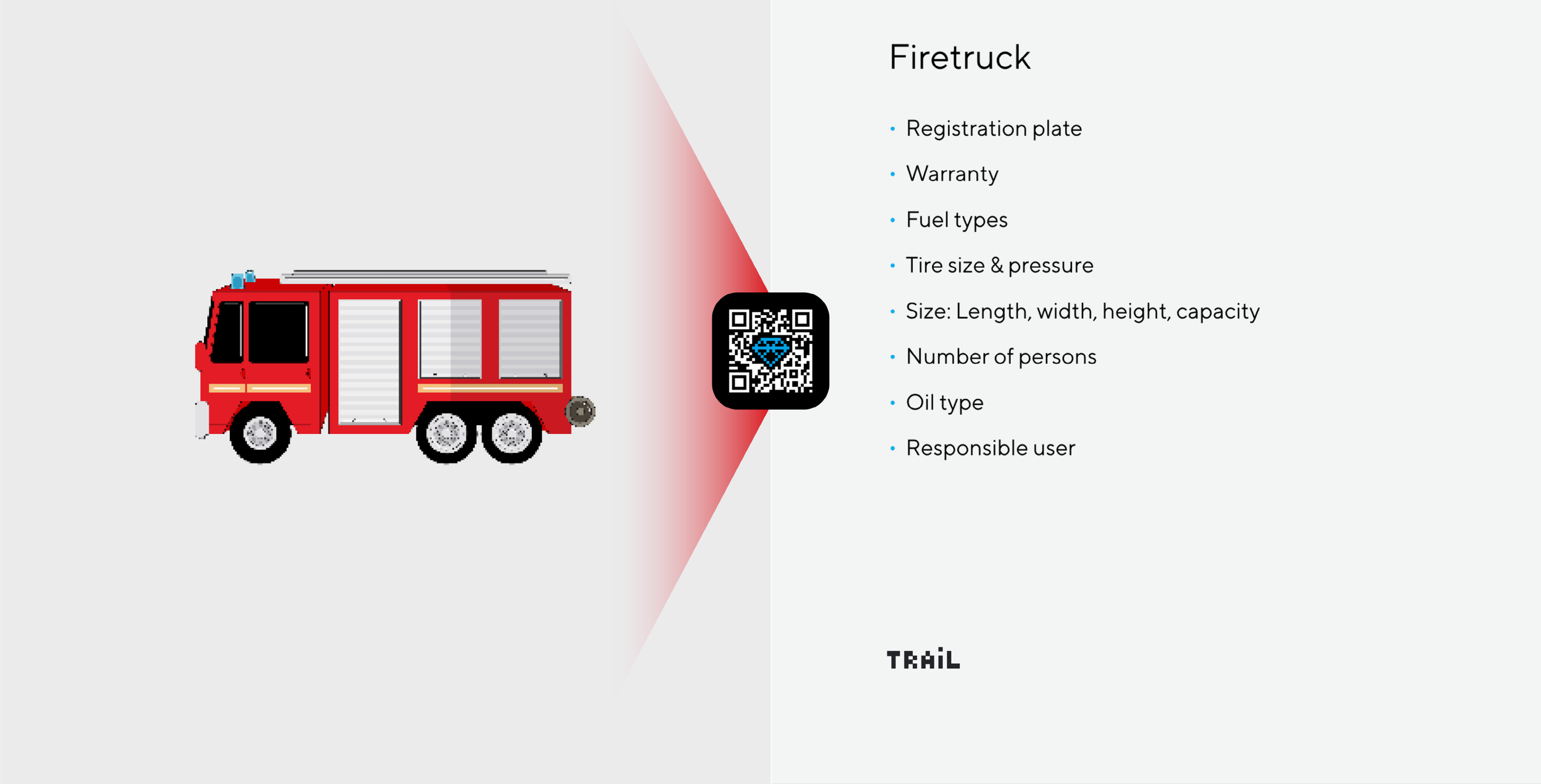
We had created their new logo as an illustrative QR code, the first-ever of its kind that is readable. Accomplishing this required coding a new QR code generator that used error detection margins to generate the code automatically according to the illustration. We went even further and animated the QR code by generating several different codes and stacking them on top of each other, resulting in the world's first animated and readable QR code.
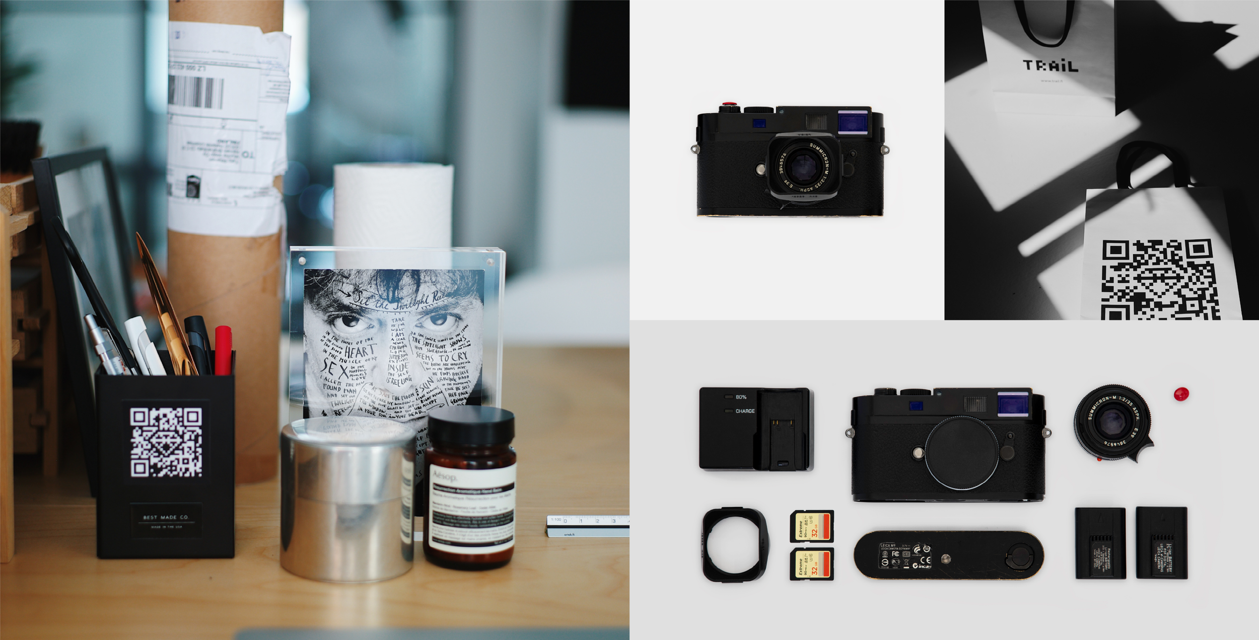
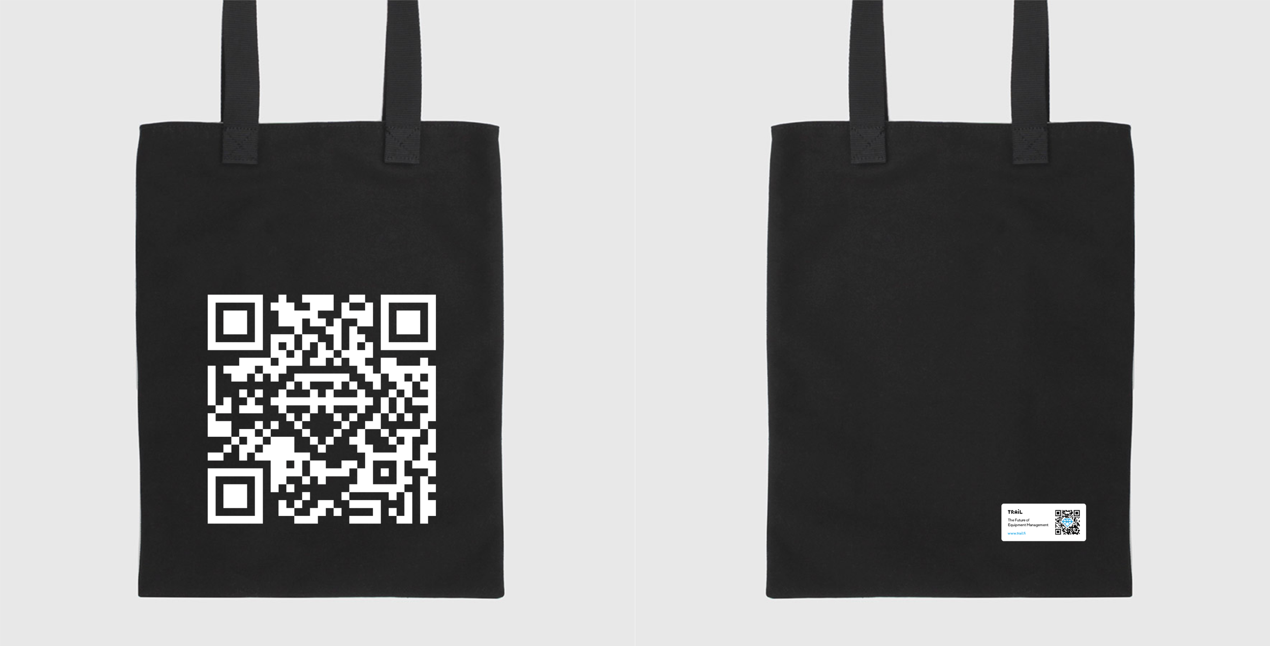
Our choice of using the QR code as the centerpiece of their rebranding was because their entire service was QR-code-based, and we even found a typeface designed specifically for software and screens that renders perfectly. In addition to the rebranding, we designed Trail's new website, merchandise (including clothing, bottles by nendo, Japanese pens, coffee, and a few beers), and took the photographs.
Our business is all about mutual trust, free hands, and building lasting friendships with our clients.
Project description:
Full rebranding with visual identity & on-going brand development for the last 8-years. Including everything from physical to digital.
Roles:
#Branding #ArtDirection #CreativeLead